“Art is not what you see, but what you make others see.” – Edgar Degas
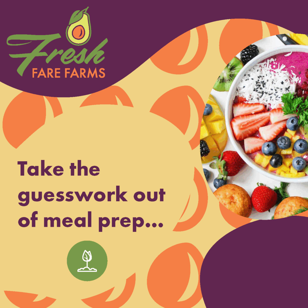
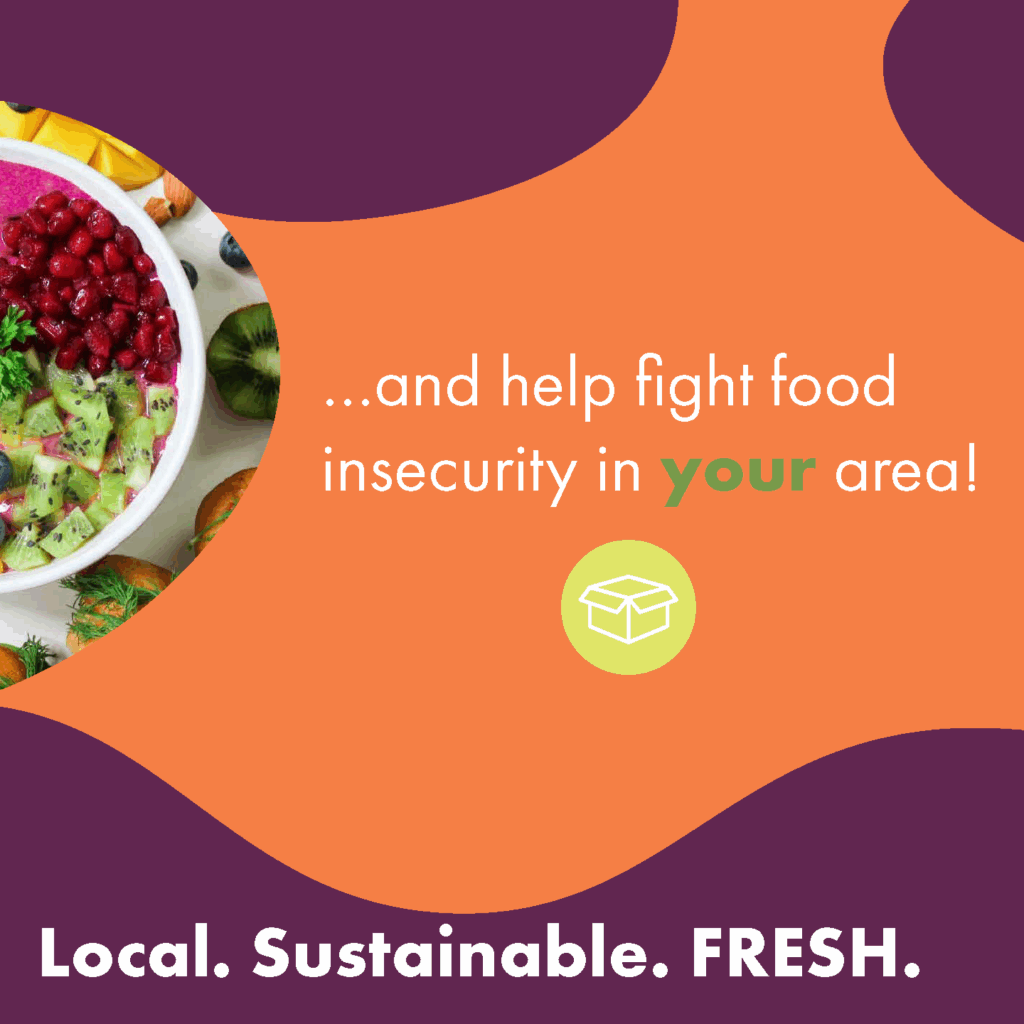
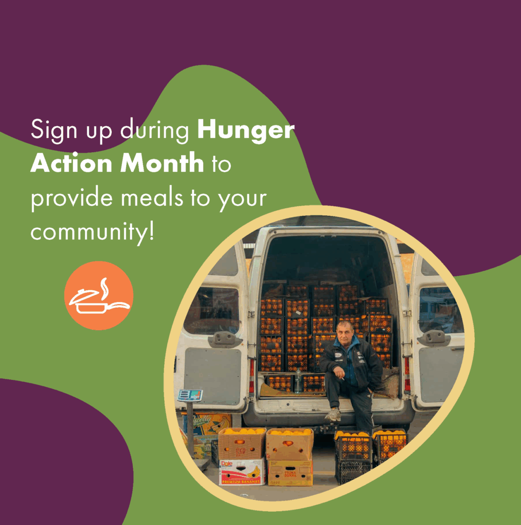

fresh fare farms
The overall concept of the carousel ad is that a fresh food delivery service wants current customers and potential clients to sign up for their service during “hunger action month.” The ad is meant to grab viewers’ attention and tell a fluid story about how they can get fresh food and help their community. My design meets the audiences’ requirements by containing simple designs made from shapes, icons, and images. The design is driven by images, and grabs viewers’ attention using various elements like bold text, and colored outlines. The message this design communicates is that a modern food delivery service is promoting their business and wants to help you fight food insecurity in your area.
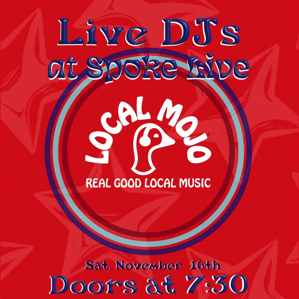
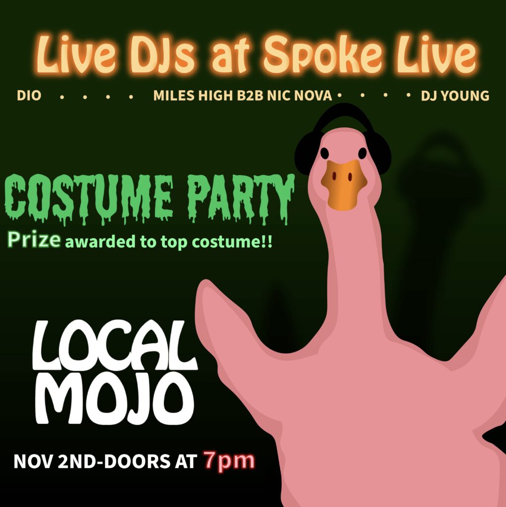
Local mojo
Local Mojo connects musicians to audiences and vis versa. The goal of these designs were to advertise Djs, and events Local Mojo were hosting at Spoke. The Costume party was featured during Halloween, this design was meant to appear festive, and eye catching. The next design was for a lowkey event. This design’s goal was to inform viewers of Live Djs, and get them to come to the event.
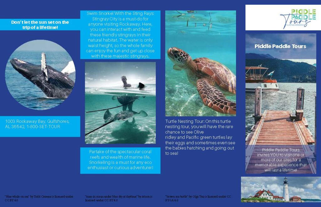
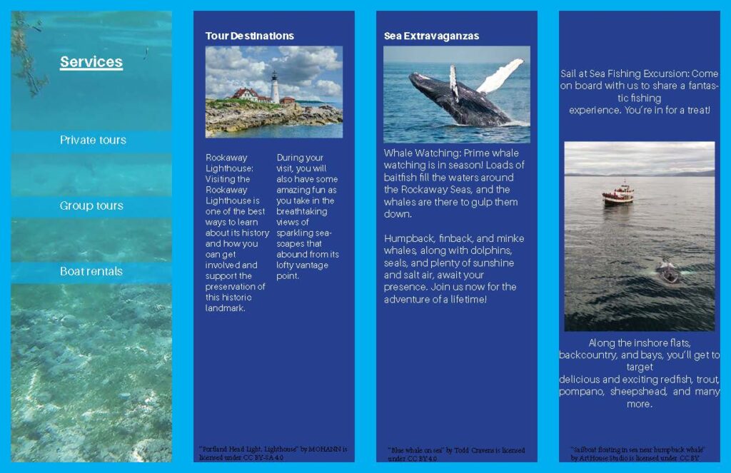
piddle paddle tours
The intent is to promote a tour company and show viewers exciting services they can use. The audience are travelers and people who like to participate in outdoor activities involving the ocean. To be effective this design had to use grids to create a trifold brochure with various text formats as well as image placements. The concept is ocean tours. This brochure is meant to show viewers possible tours they can take. The design meets the audience requirements by featuring various captivating images, containing needed information, and showing them where to go to book a tour. This design artifact communicates a message of touring open waters and seeing animals like whales and sea turtles. I used grids to organize the information and images. I also used various tools to morph images and create engaging type. This design artifact represents my best work but can benefit from some improvements.
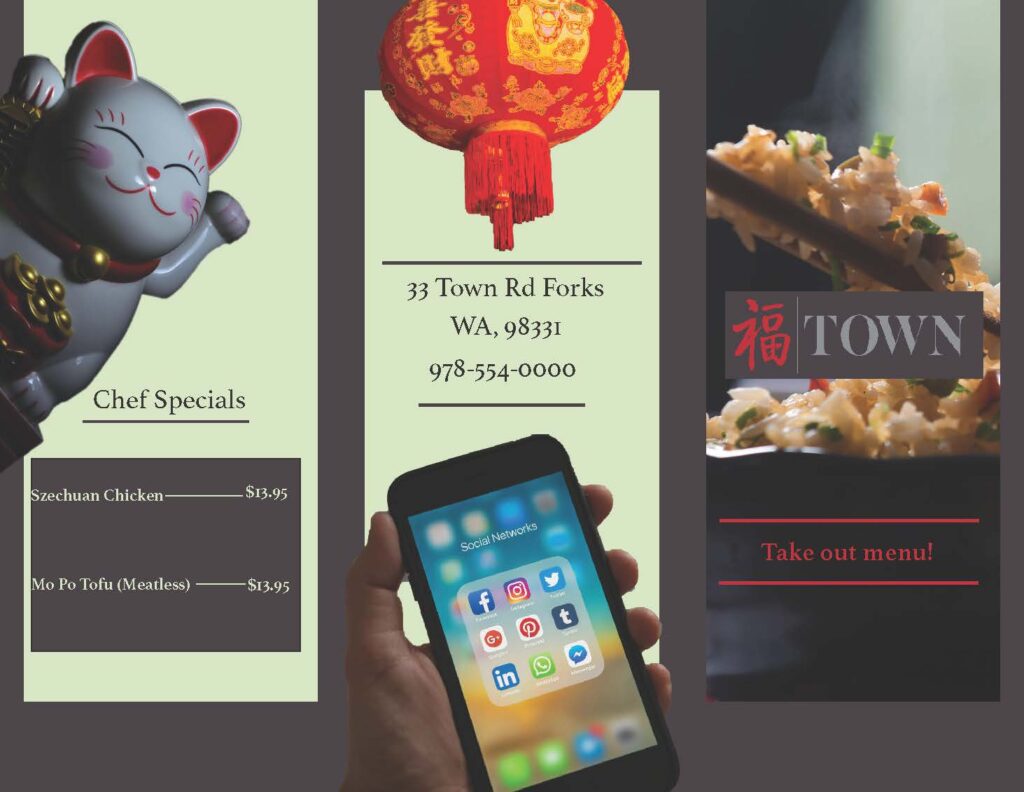
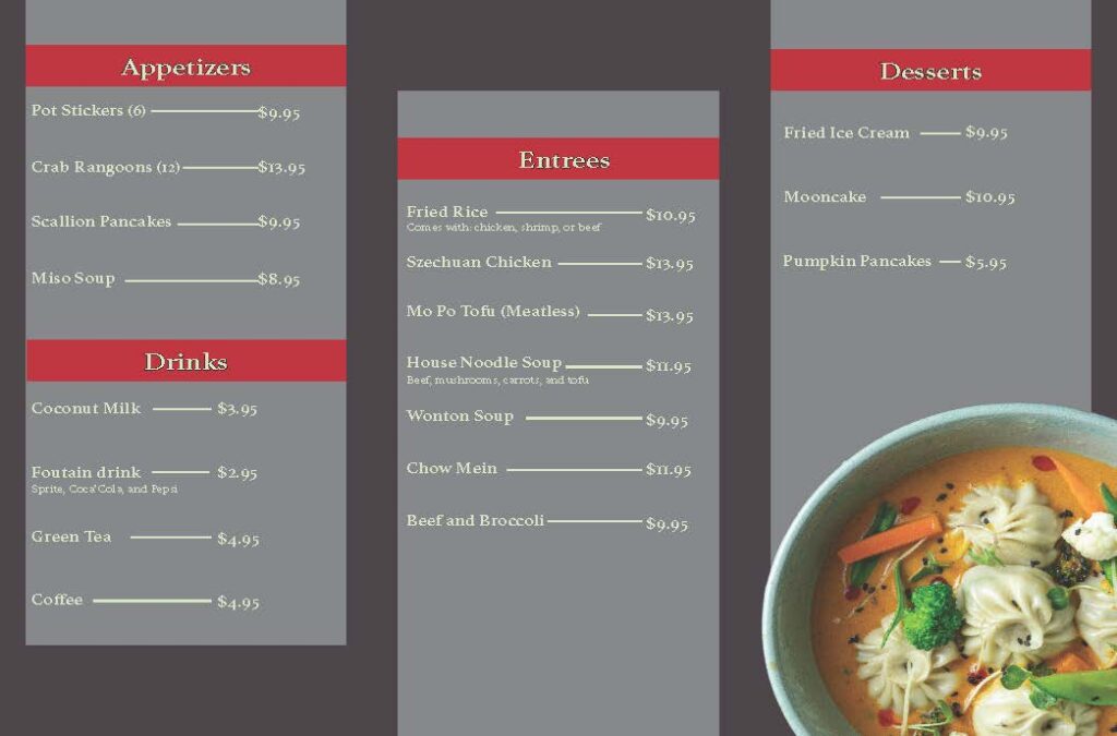
town menu
The intent of the tri-fold menu is to appeal to the current clientele and show that TOWN provides a high-end dining experience. The audience for this design is people in their 30s-60s. To be effective this design had to represent TOWN’s high-end dining experience. This design effectively communicates this message through the use of the elements and principles of design. Imagery is careful displayed over solid shapes and backgrounds with the use of grids. These shapes and images work together to grab the viewers attetion.

donut.com
The intent was to create an engaging banner ad that people would like. This ad was supposed to promote fresh donuts and get people to go to the company’s website. The audience includes people of various ages who enjoy sweet treats. The design artifact needed to include various moving elements and motion tweens to be effective. It needed to capture the audience’s attention and maintain it. I used the company’s colors to create this ad. A successful way I did this was by using the colors as sprinkles on the donut as well as for the frosting and background. The donut rotates throughout the animation to keep the audience’s attention and the bite being taken out of the donut emphasizes the message that fresh food is good to eat. I used color, balance, and visual hierarchy to create this ad. The donut and url placement at the end create balance with the elements. The way the text appears guides the viewer through the ad and shows up in a stair like fashion creating a sense of hierarchy within the text.
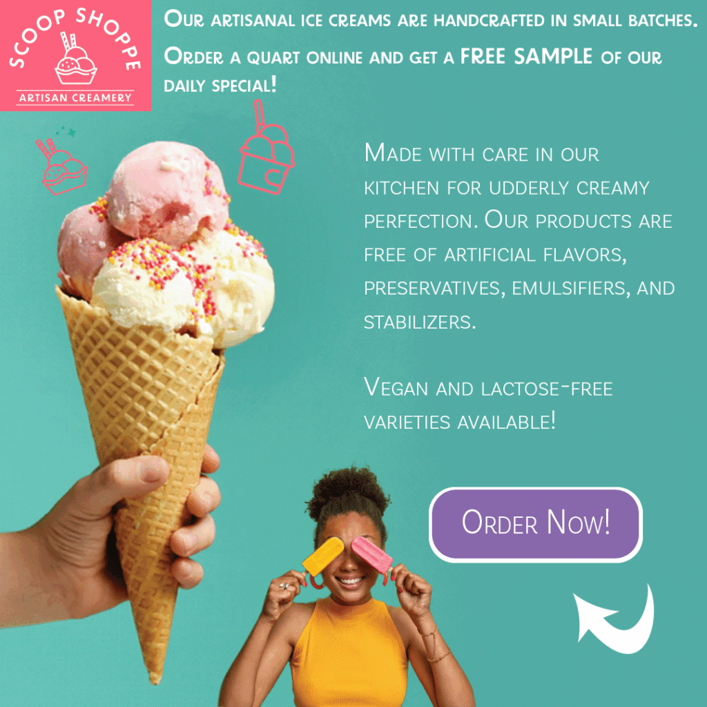
scoop shoppe gif
The Scoop Shoppe gif is meant to draw in vegan customers, and customers of various ethnic backgrounds. This ad had to show diversity, and demonstrate my ability to create a design that captures the viewers attention through animated elements. Multiple aspects of this ad are animated for example the glowing CTA, and blinking icons. These elements work together to guide the viewer through the ad and maintain their attention.
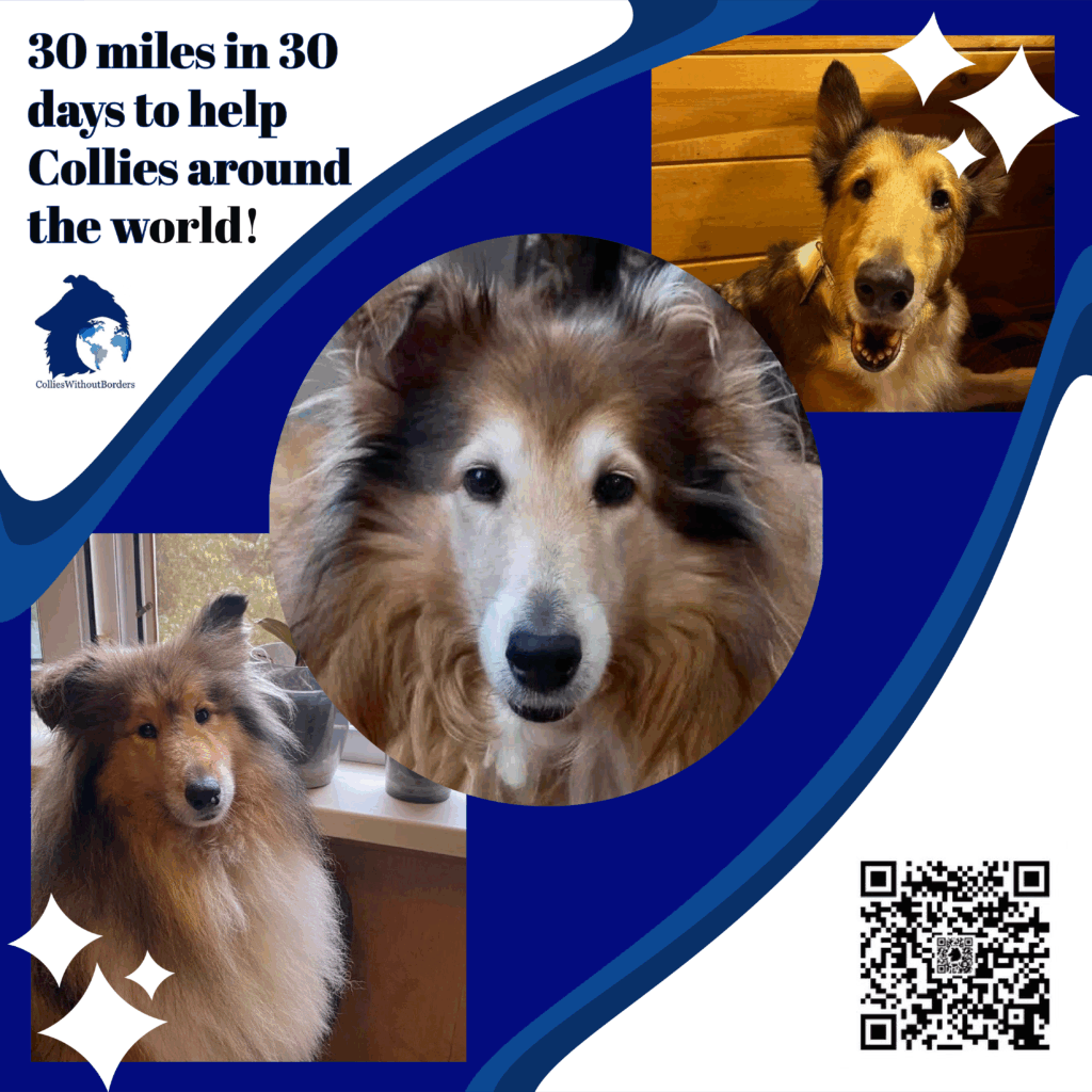
collies without borders
I was commissioned to make the this ad for collies without borders facebook page. the goal is to get people to walk 30 miles in 30 days to raise money for these collies in foster care.
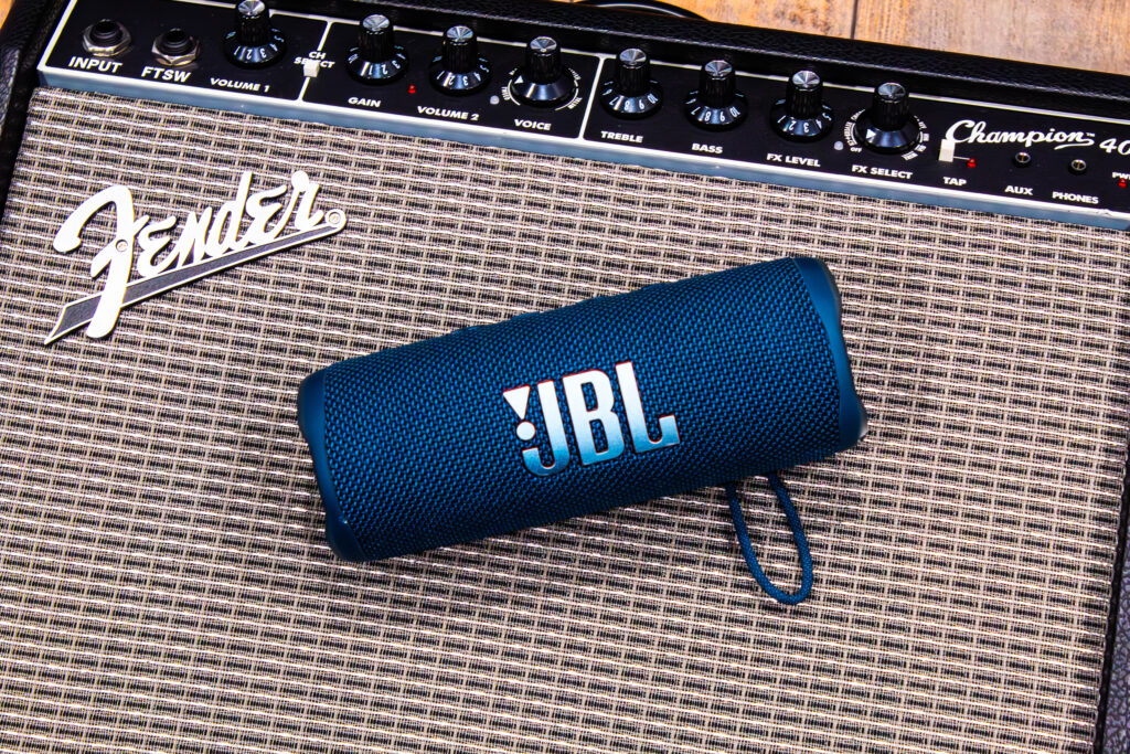
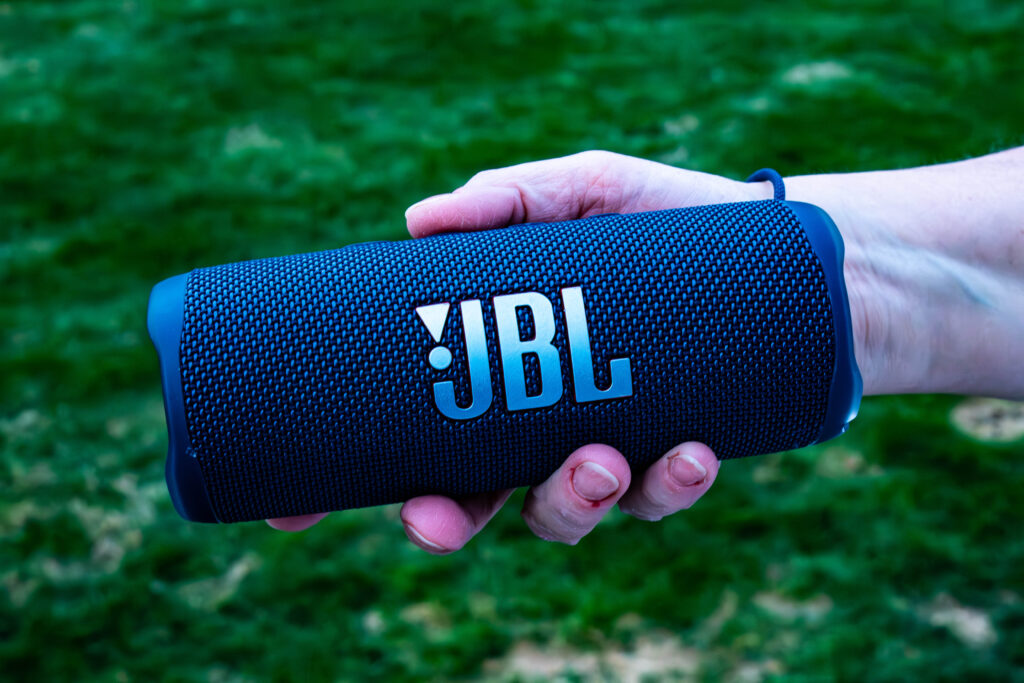
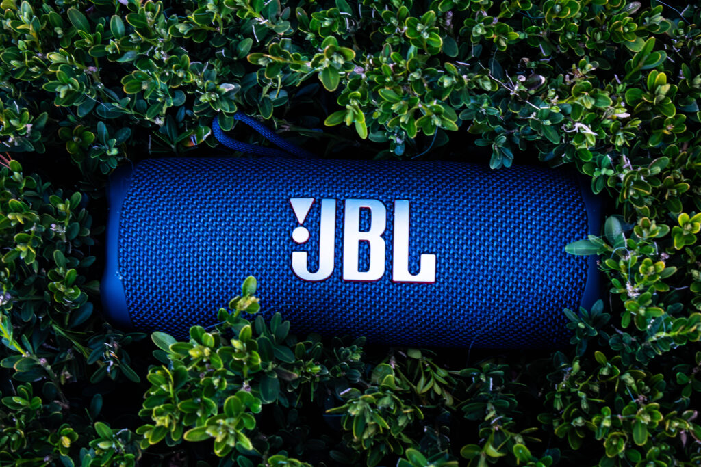
jbl photos
The way I photographed the JBL speaker was by focusing on creating professional looking photos. I knew that blue and green contrast well with each other, so I placed the speaker on top of a bush outside my house. This photo is my favorite since it features elements of nature. I then photographed my mom holding the speaker to help it stand out and draw attention towards it. My goal for this photo was show viewers that this speaker was desirable since it is being held. After that I placed the speaker on an amp laying on its back. I liked how the texture of the amp and speaker were similar, but the colors were vastly different. The goal for this photo was to convey music. Since amps are used in concerts and when people play music, placing the speaker next to one reminds viewers of music and fun. I then placed the speaker next to water jugs. I did this because the water jugs were blue and so was the staircase in which the photo takes place. All these blue tones help to compliment the speaker. The placement of the speaker around water jugs also represents how the speaker itself is waterproof.
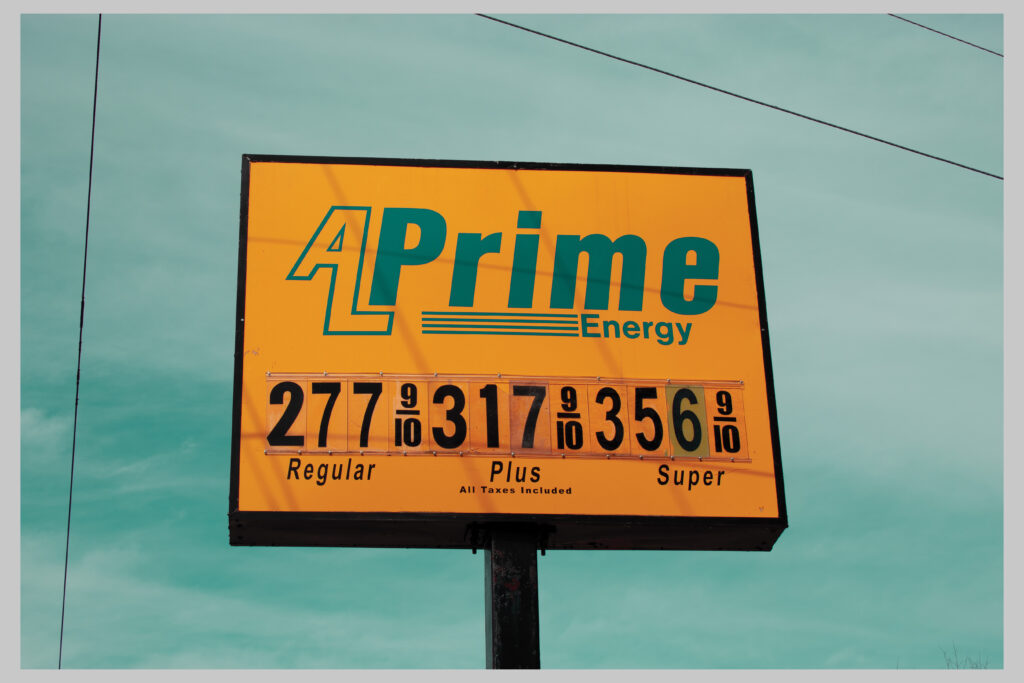
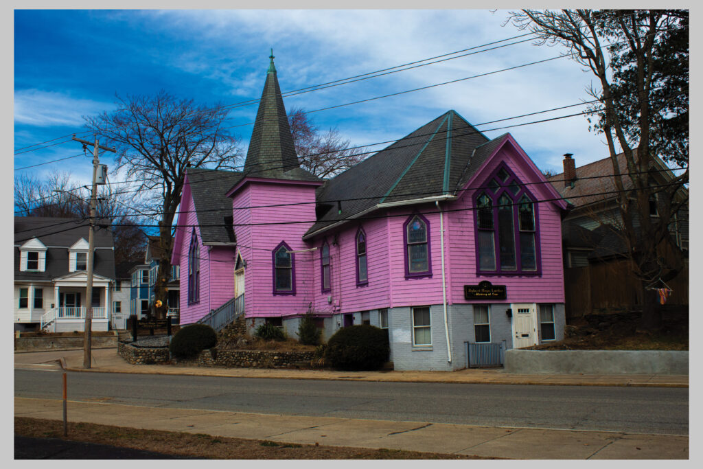
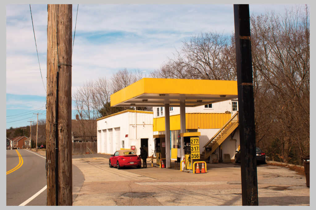
color in woonsocket
This series explores the expressive power of color in everyday spaces. The vivid yellow of a gas station sign against a turquoise sky, the striking lavender façade of a neighborhood building accented with magenta frames, and the warm golden tones of a roadside gas station all highlight how color transforms ordinary scenes into moments of visual energy. Each image captures the interplay between bold hues and their surroundings, revealing how light, contrast, and saturation can elevate familiar places into vibrant compositions of mood and atmosphere.
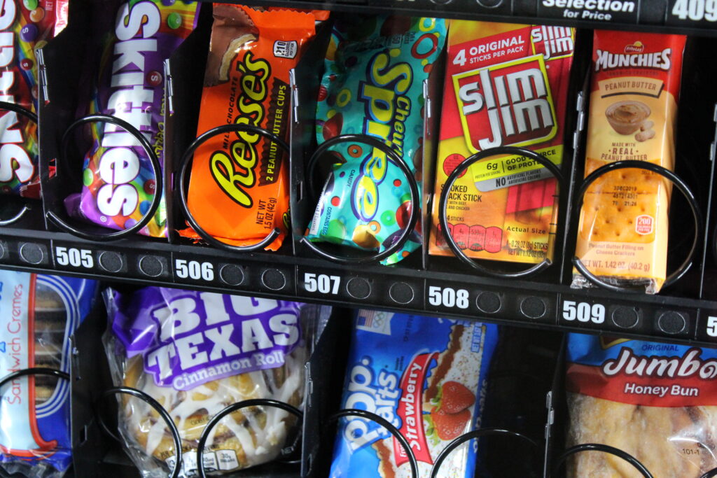
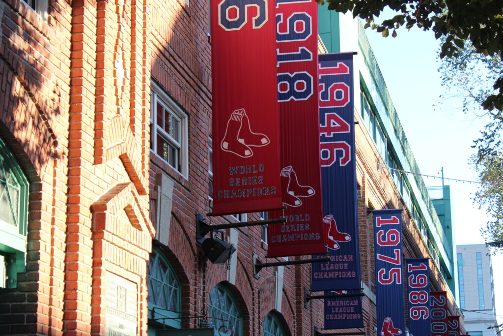
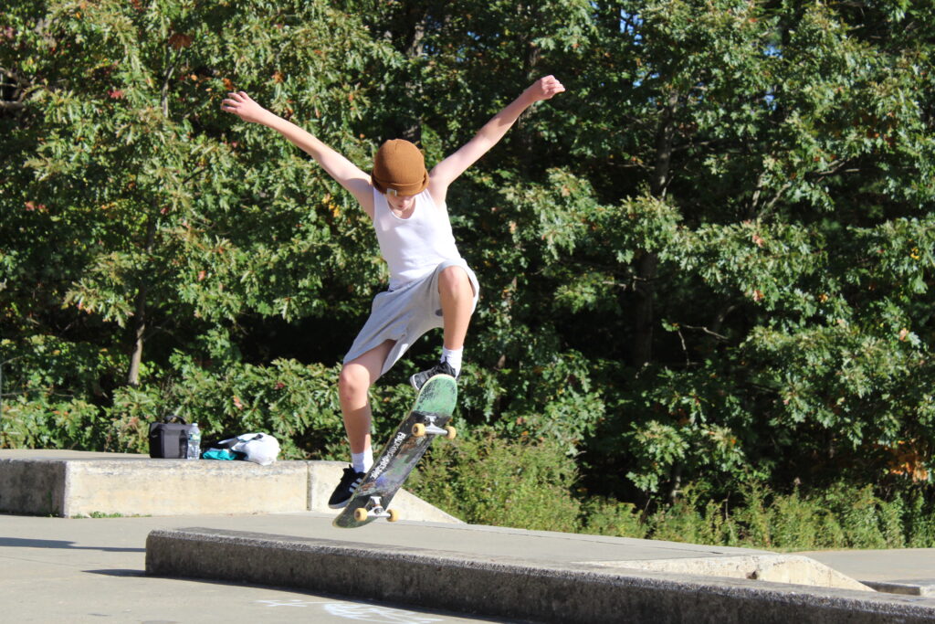
boston ma
This collection of photos captures a mix of everyday moments and personal interests that reflect a balance between urban energy and natural calm. From the vibrant colors of vending machine snacks and the dynamic motion of skateboarding to the quiet presence of horses in rural settings, these images highlight contrast movement and stillness, human activity and animal serenity, structure and openness. Together, they represent an appreciation for both the spontaneous and the serene sides of life, showcasing diversity in subject, texture, and tone.
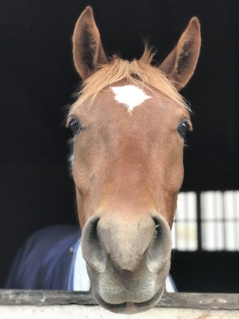
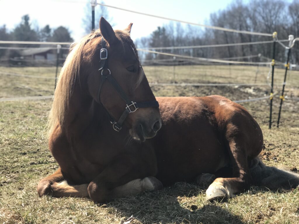
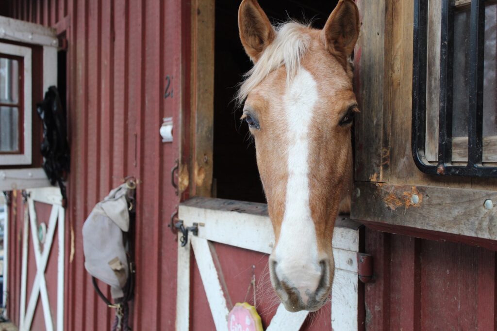
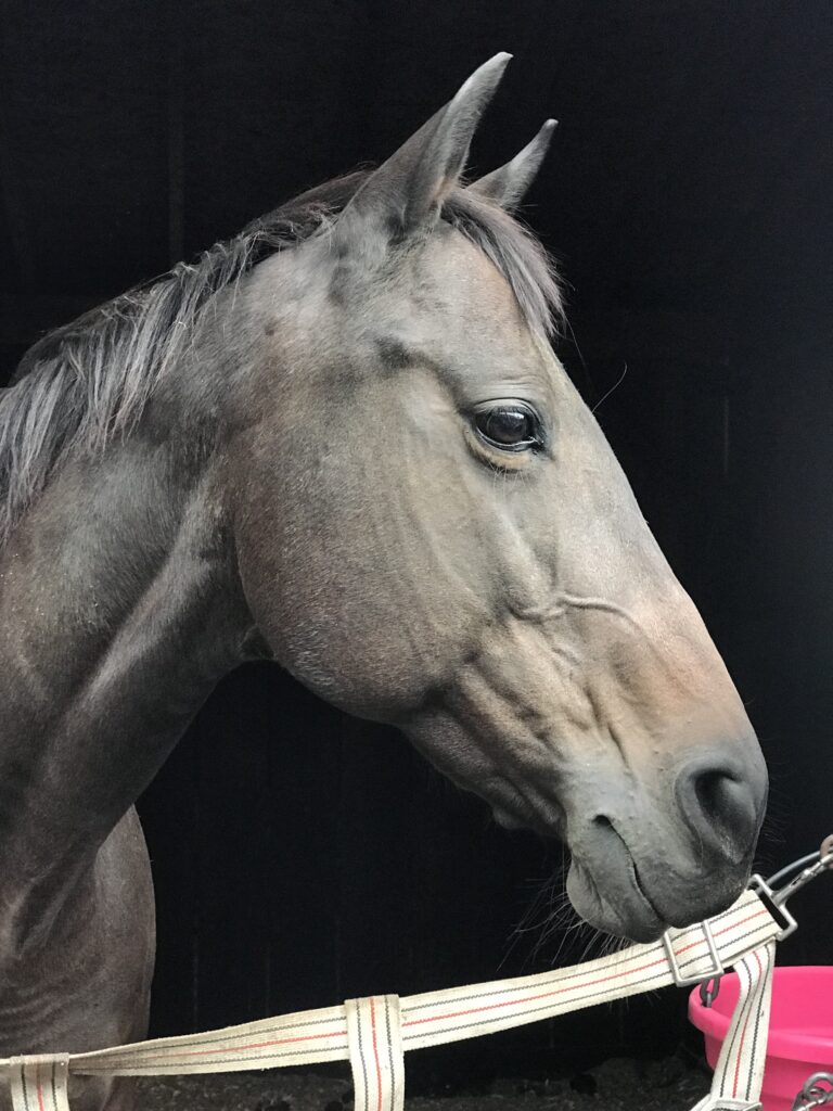
equestrian photography
This series focuses on the calm strength and gentle spirit of horses, capturing their personality through natural light and candid moments. Each photo highlights a different aspect of their character curiosity, relaxation, and quiet grace set against simple, rustic backdrops. Together, these images celebrate the bond between humans and horses, emphasizing the beauty found in stillness, texture, and connection.
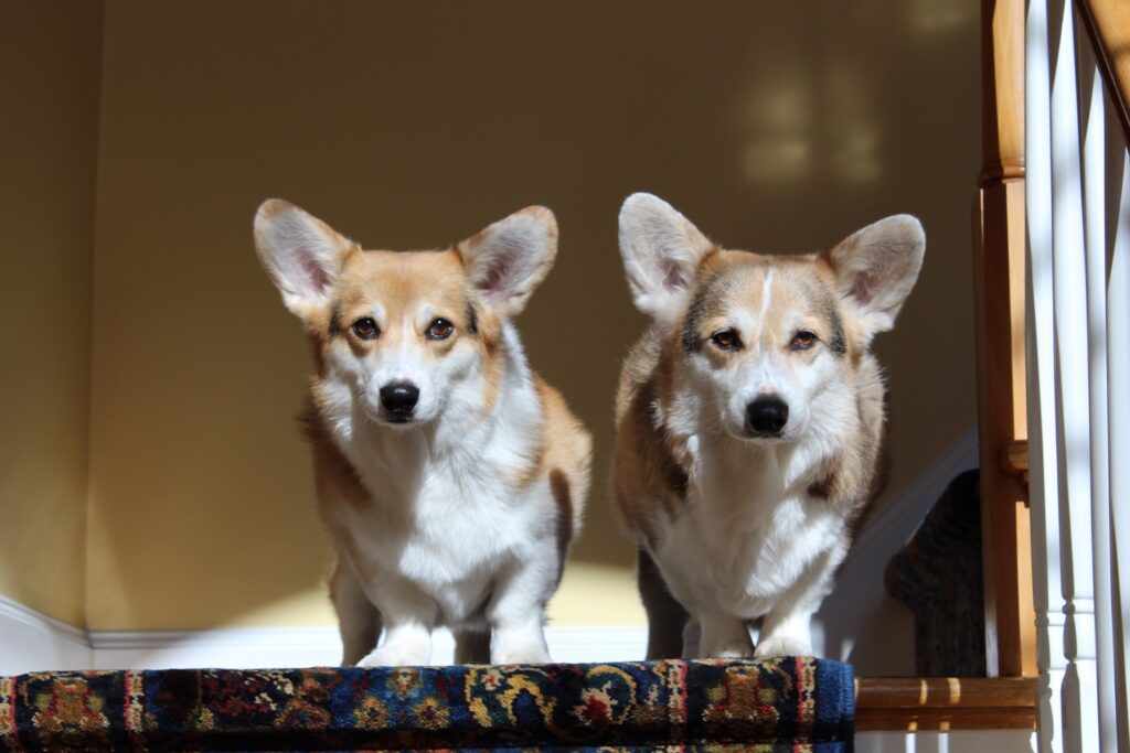
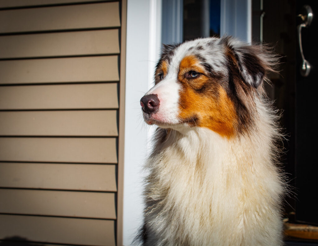
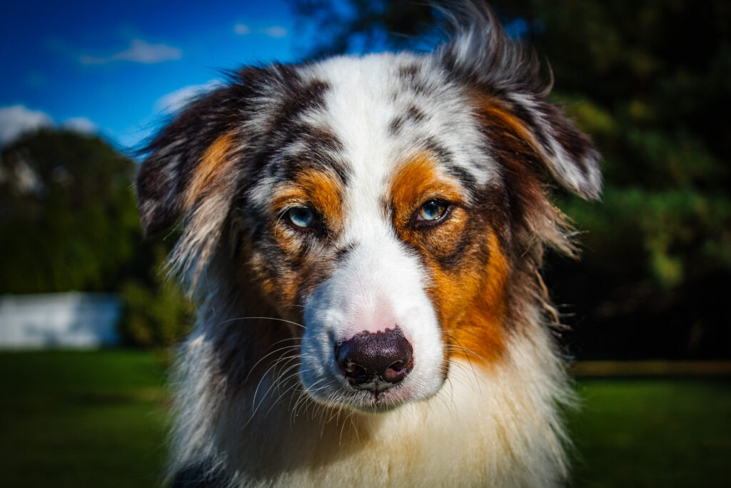
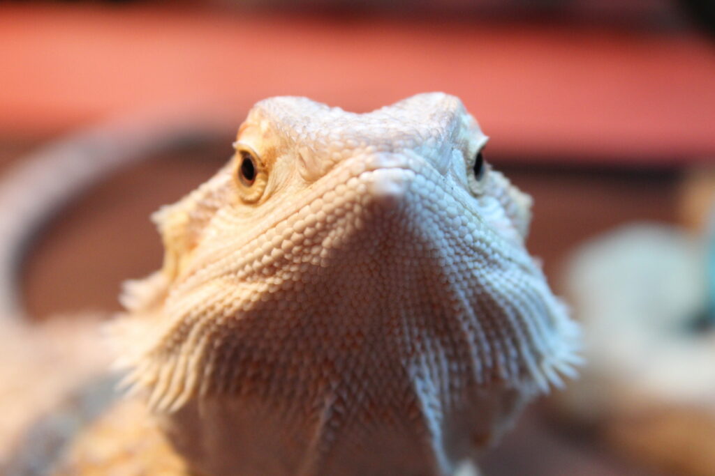
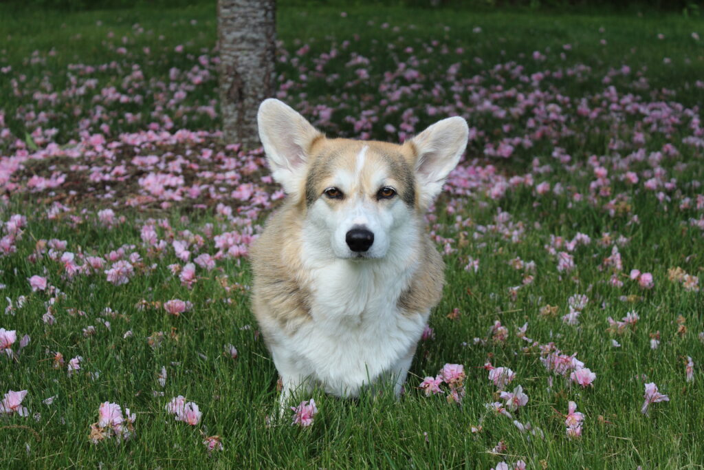
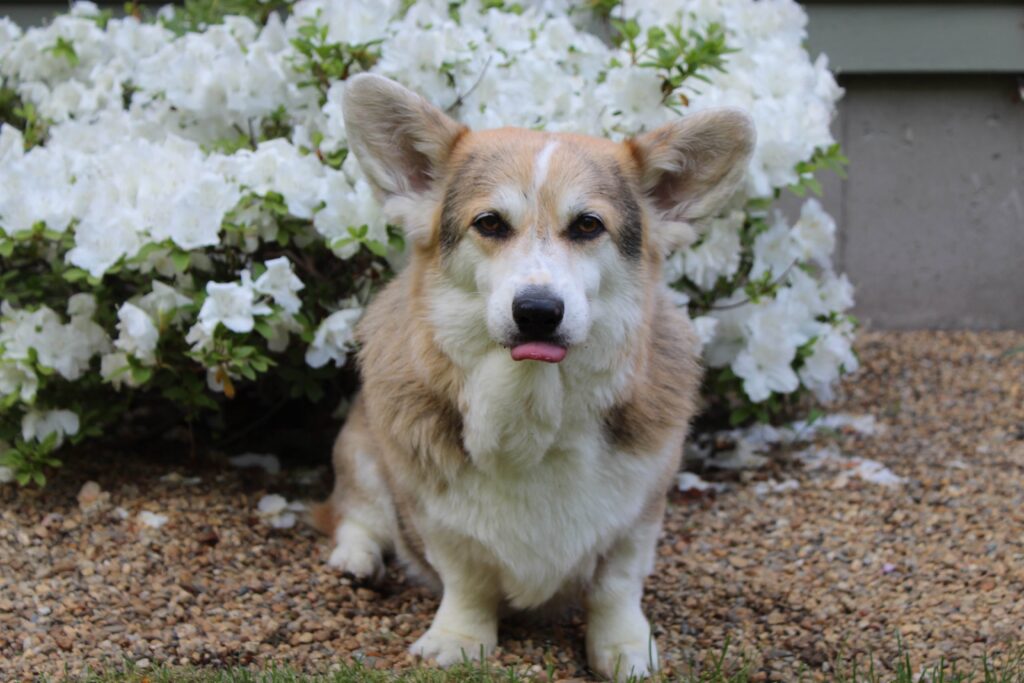
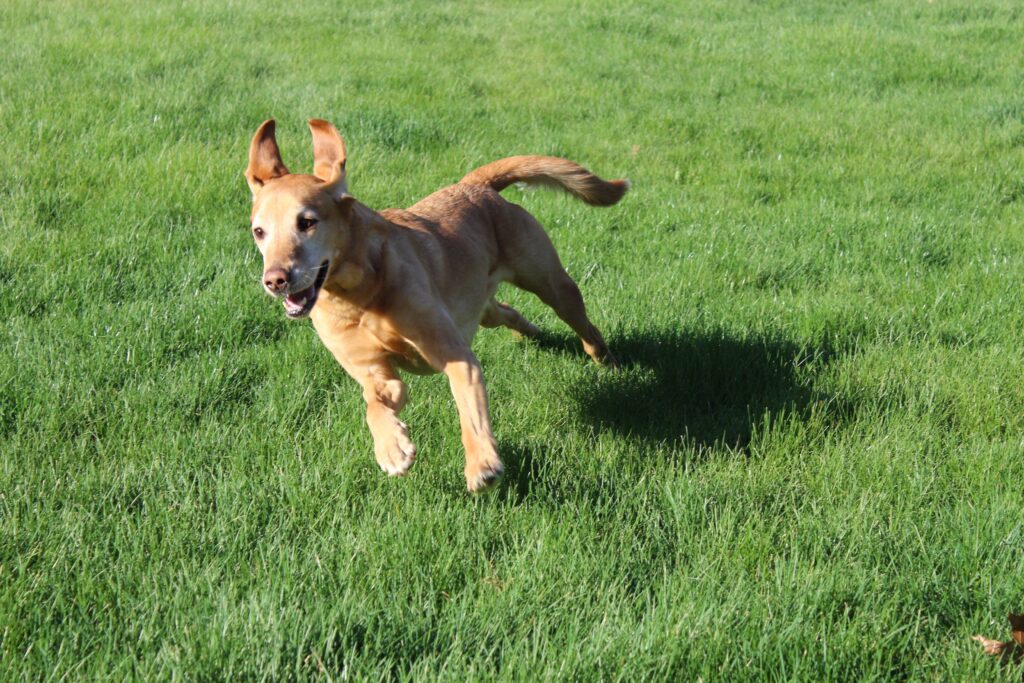
pet photography
This collection captures the playful energy and distinct personalities of animals, focusing on moments of curiosity, companionship, and movement. From the loyal gaze of dogs to the unexpected charm of a reptile, each photo highlights character and emotion in natural, unposed settings. Together, these images express warmth, liveliness, and the joy found in observing animals simply being themselves.
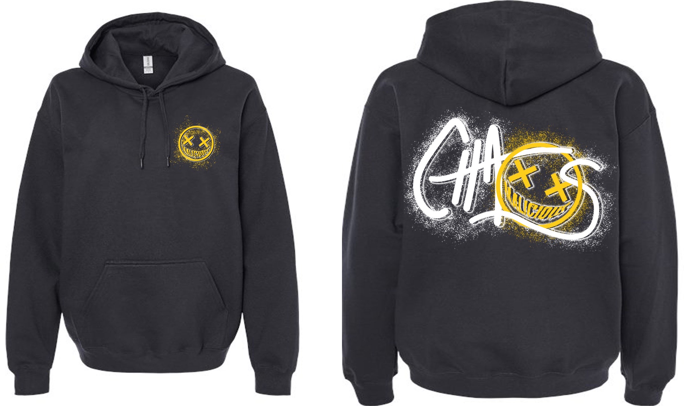
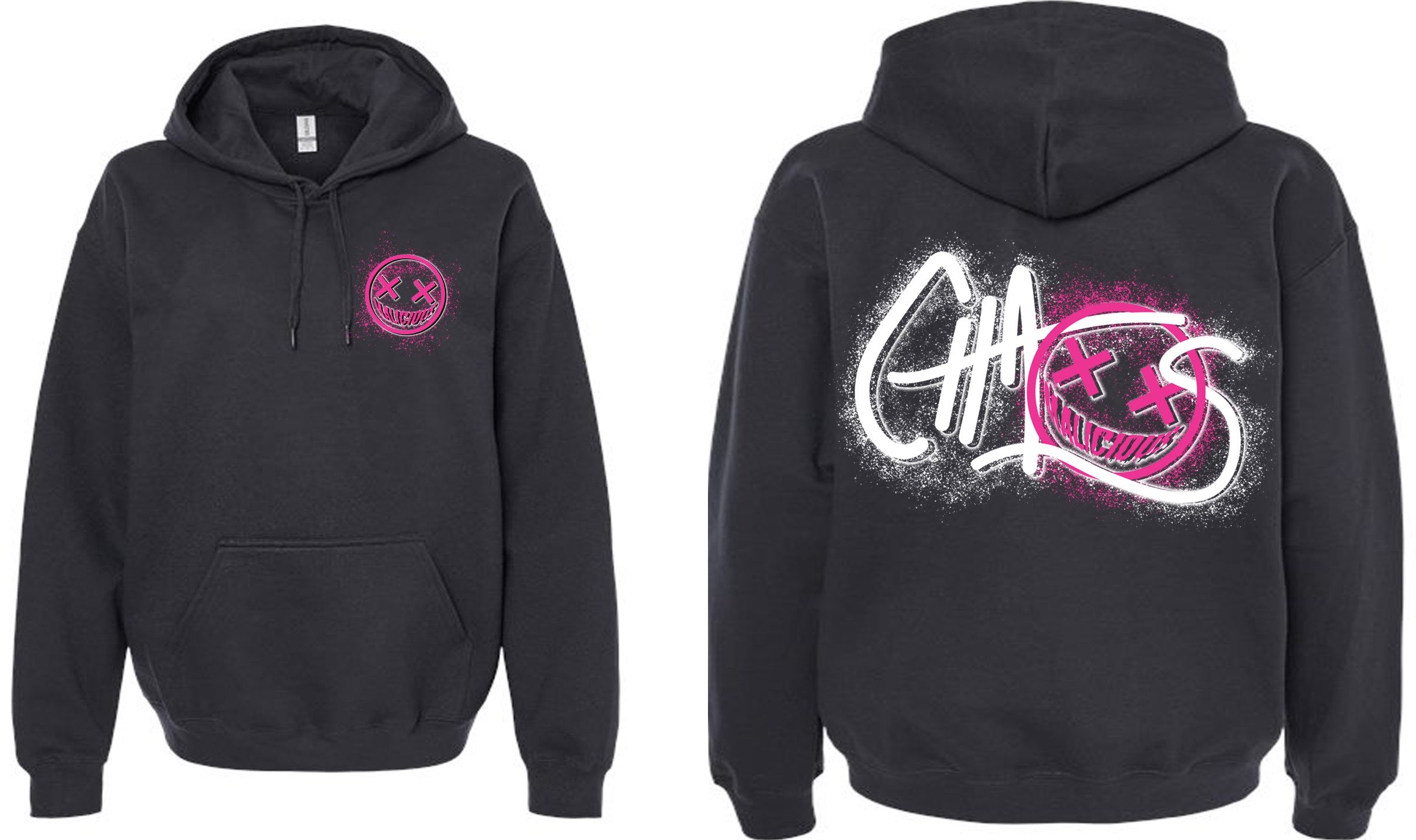
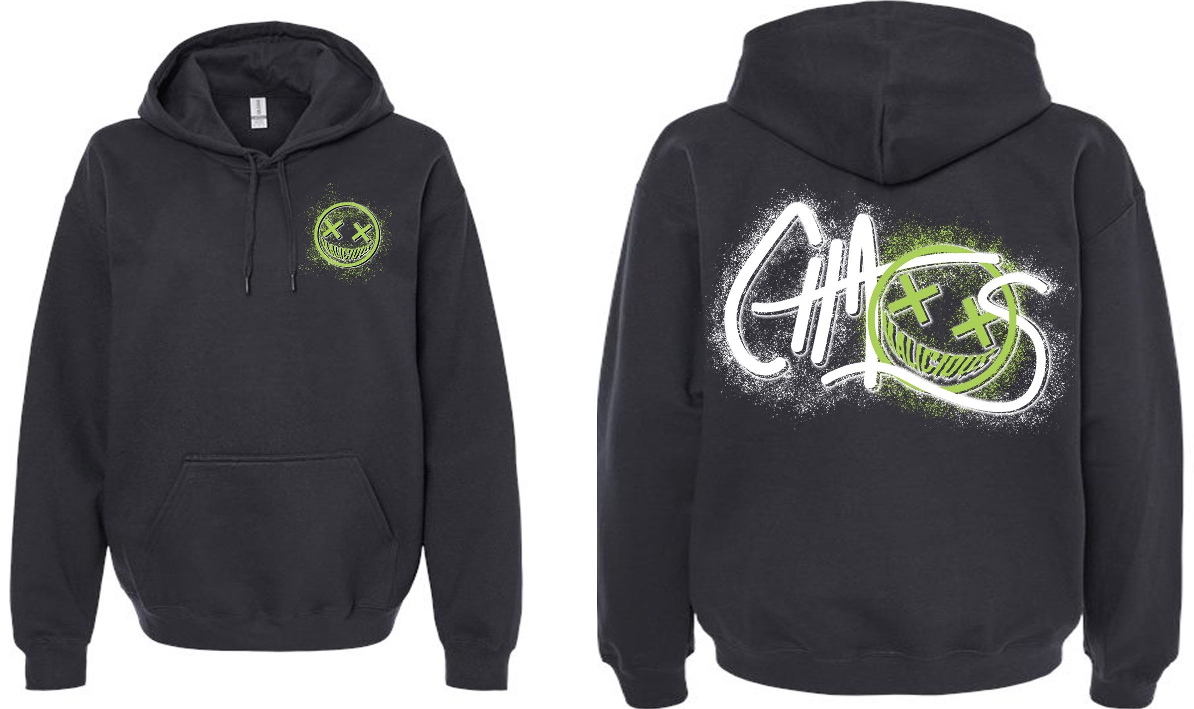
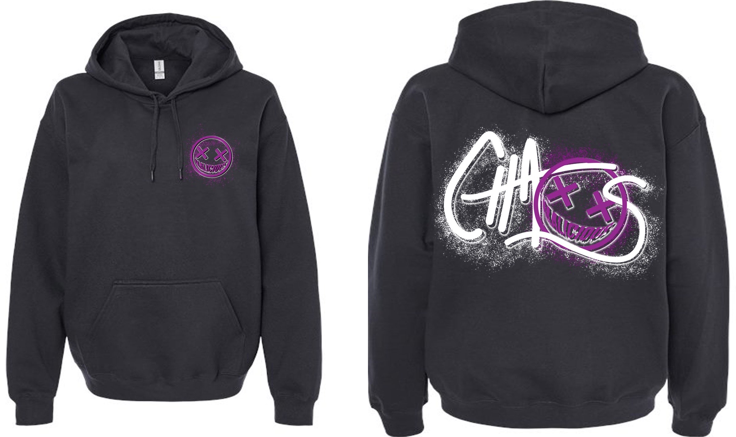
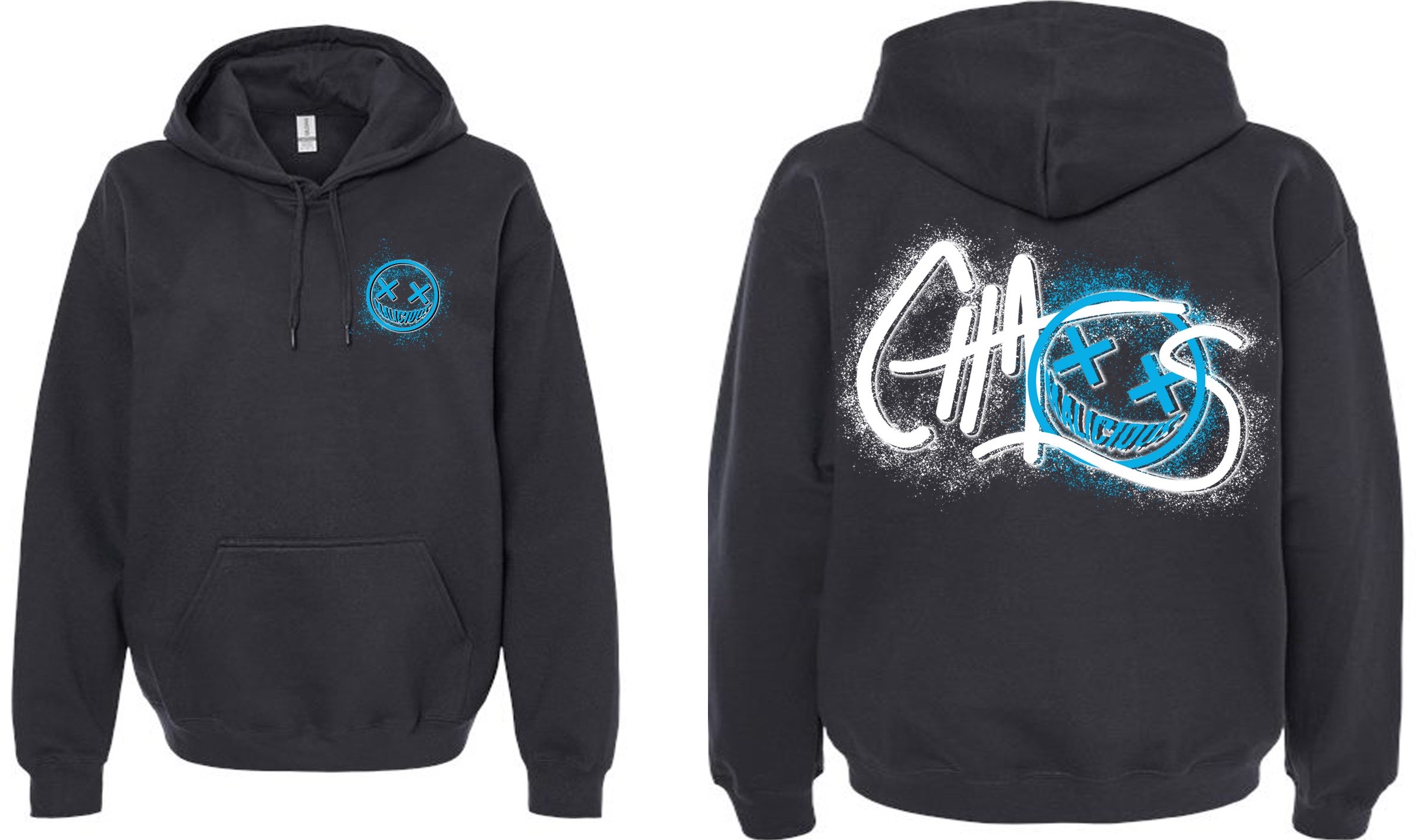
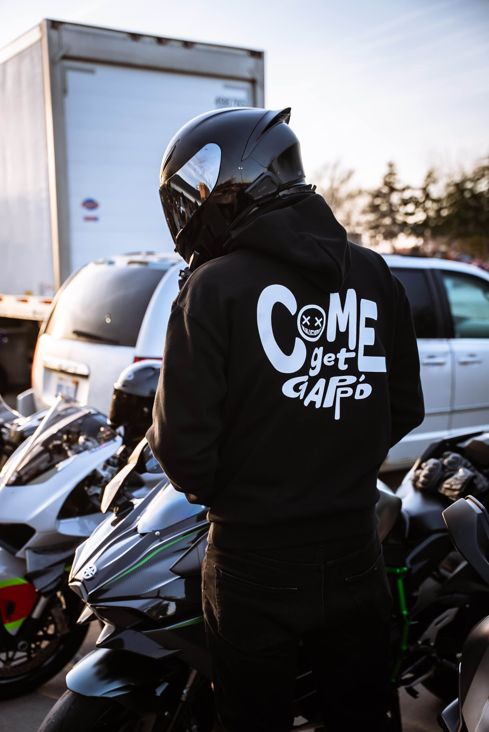
malicious racing
Malicious is an online motor vehicle club. They aim to connect people across the biking/car community, as well as modernize the hobby and educate people about what they do. The goal of these designs were to give the viewer a friendly but cool feeling. The logo represents how vehicles are inviting yet dangerous, which is why the eyes in the logo are X’s and the word “malicious” is curved into a jagged looking smile. The “come get gapp’d” sweat shirt refers to terminology and pokes fun at commonly used sayings within the motorcycle/car community. The text was made to give the viewer a playful/fun feeling. The logo was also incorporated into this design helping it to represent the brand.